Title
Froov
Type
Year
2022
Branding
Logo
Packaging
Each can of Froov is a testament to the unhurried process of slow brewing, allowing the natural flavors of organic fruits to unfold gracefully. Froov stands as a beacon of straightforwardness, offering an organic fruit soda that embraces the beauty of simplicity.
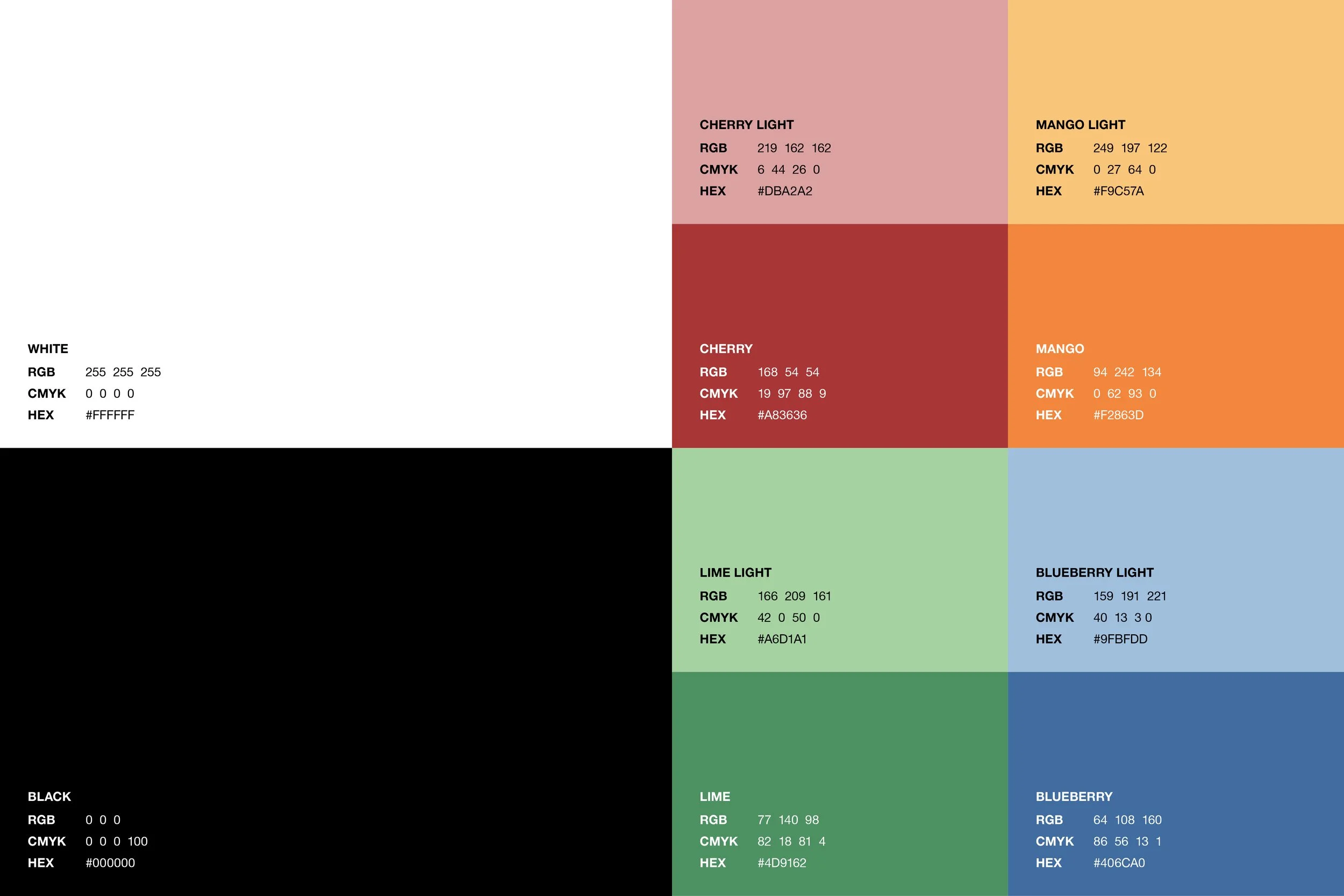
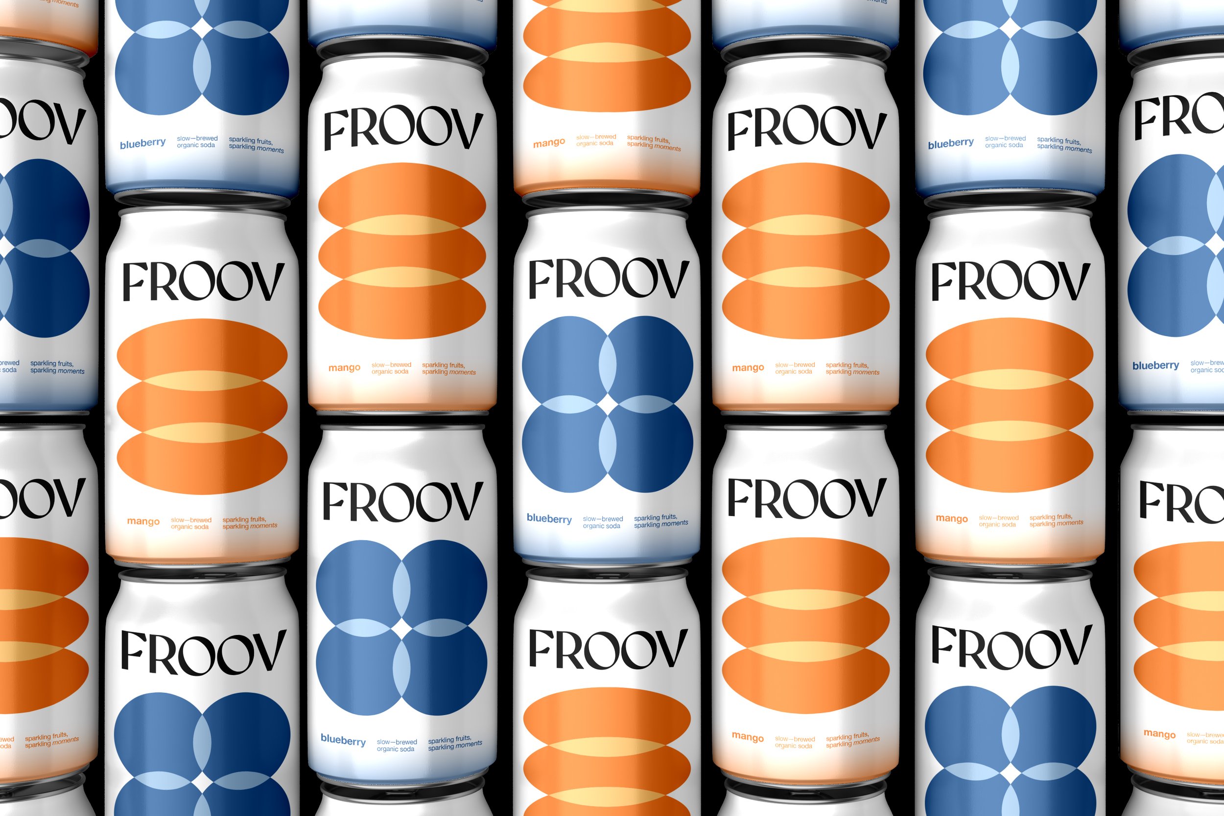
The intentional colour selection of a pristine white for each fruit serves as a symbolic representation of purity and simplicity, aligning seamlessly with Froov's ethos. This strategic use of color not only enhances the aesthetic appeal but also communicates the brand's commitment to authenticity and clarity.
Moreover, the design approach incorporates four distinct gradients and simple geometric shapes to create illustrations for each fruit—specifically, cherry, mango, lime, and blueberry. This deliberate use of minimalistic forms reinforces a sense of refined elegance, ensuring that the visual elements align harmoniously with Froov's brand image.


